
Key Market Technicals
Key Market Technicals
9/28 Memo - Analyzing Market Technicals to Get a Gauge on the Future

This morning, before market open, we received some extremely interesting news.

This is certainly a macro development that will influence the direction of the markets. Essentially, what this means is that the markets are showing “signs of breaking” from the Federal Reserves aggressive tightening cycle. Today, we are going to be more focused on market technicals but I wanted to touch briefly on this and will go into more depth this weekend.
“What does breaking mean in terms of the market?”. The best way to think of this is to understand the two different types of money that exists in the financial system.
Money in circulation (usually created from debt issuance)
Banking liquidity
When the Federal Reserve (US Central Bank) aggressively tighten’s monetary policy, this strains the banking system and destabilizes banking conditions. If you’re not familiar with why the USD would go up during a tightening cycle or how money isn’t really just “money”, I will touch up more on that later (like I mentioned above). The key thing to know here is that it is bullish for financial markets. This ultimately brings us to the questions, “How much is too much and has the Fed finally gone too far? Will they pivot sooner than later?” Fed aside, will other central banks ease financial conditions too? It’s a sign of better days ahead (hopefully) for market participants.

Is the Stock Market Bottoming?
The purpose of this here, today, is to objectively look at market technicals without thinking of Macro Economics. We should be 100% unbiased and look through the lens of a technical market analyst to get an idea of what the key market indicators are telling us. Sometimes, on Twitter, I say, “if I didn’t know anything about macro, this is what xyz chart is telling me.”
I think it’s important to show all of you the developments I am seeing.
There are 4 charts we will look at today:
S&P 500
NASDAQ Composite
ARKK Innovation (the bubble poster child and representative of high beta stocks)
SKYY (cloud computing and growth) ETF
These are the 4 charts I follow the most to help me map out where my particular investing strategy is going. I would classify myself as an investor first and foremost who happens to just invest in really great, growing, businesses. I suppose some would classify that as a “growth” investor.
Just Looking at Charts, Not Thinking About Macro, it Definitely Looks Like the Market is ‘Trying’ to Form a Major, Long Term, Low
The common theme I am seeing here in the major index’s is that they are both extremely over sold with a positive breathe and divergence underneath the market.
S&P 500 Daily Chart
The S&P 500 is showing over sold readings on the daily chart and is disconnected from the major moving averages. Typically when this happens, the market needs to snap back to previous trend lines. Since this downward move was so aggressive, I can see it going straight to the 30 day moving average before the market even thinks about another move down.
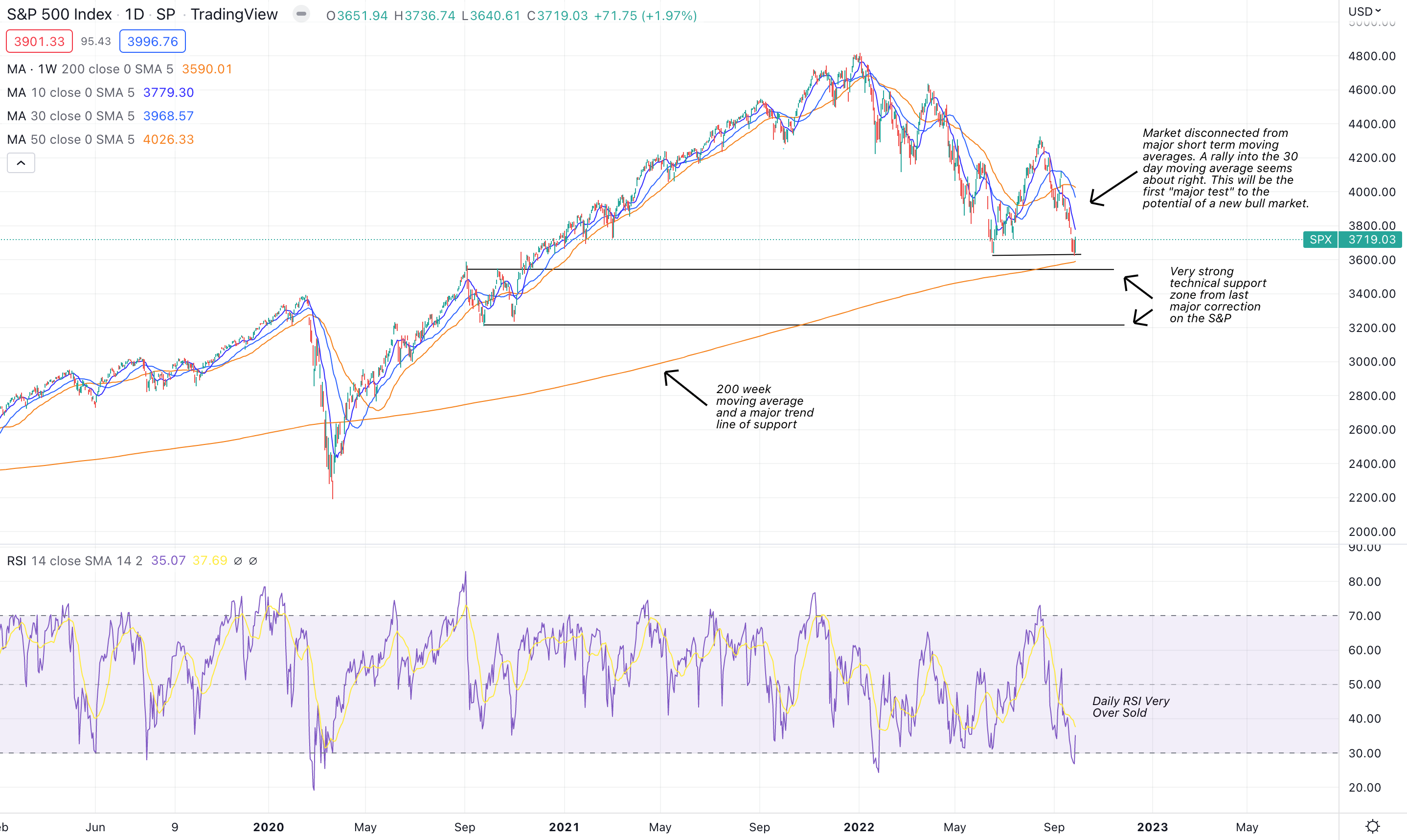
Even if the markets do decide to move lower, there is major support in this zone. Both of those black lines are likely to set up an area for a major low that can be the beginning of a multi-month rally. It’s even stronger when you couple in the 200 week moving average in this equation which will sure push the markets up from here.
S&P 500 Weekly
The longer term, weekly chart, is not as clear as the daily chart. It does appear that it favors more downside but the downside can’t be very much as the weekly RSI is moving toward over sold levels and the market reaching critical support zones.

There are two developments to pay attention to:
Will the 200 week moving average hold? If not, we are likely heading toward the next secular bear market.
The MACD is curling over but can it get momentum or will it turn up in the event of a few green days?
As mentioned above, it has a bearish bias but it’s not necessarily an area I’d be looking to go short on.
NASDAQ Daily Chart
The NASDAQ has a similar story as the S&P 500 in the sense that it is very over sold and detached from short term moving averages. The RSI is very over sold and we are retesting June lows currently, which is a major area of support. I just can’t see the market breaking this (in the short term) without some sort of meaningful bounce to move the RSI from over sold to neutral conditions.
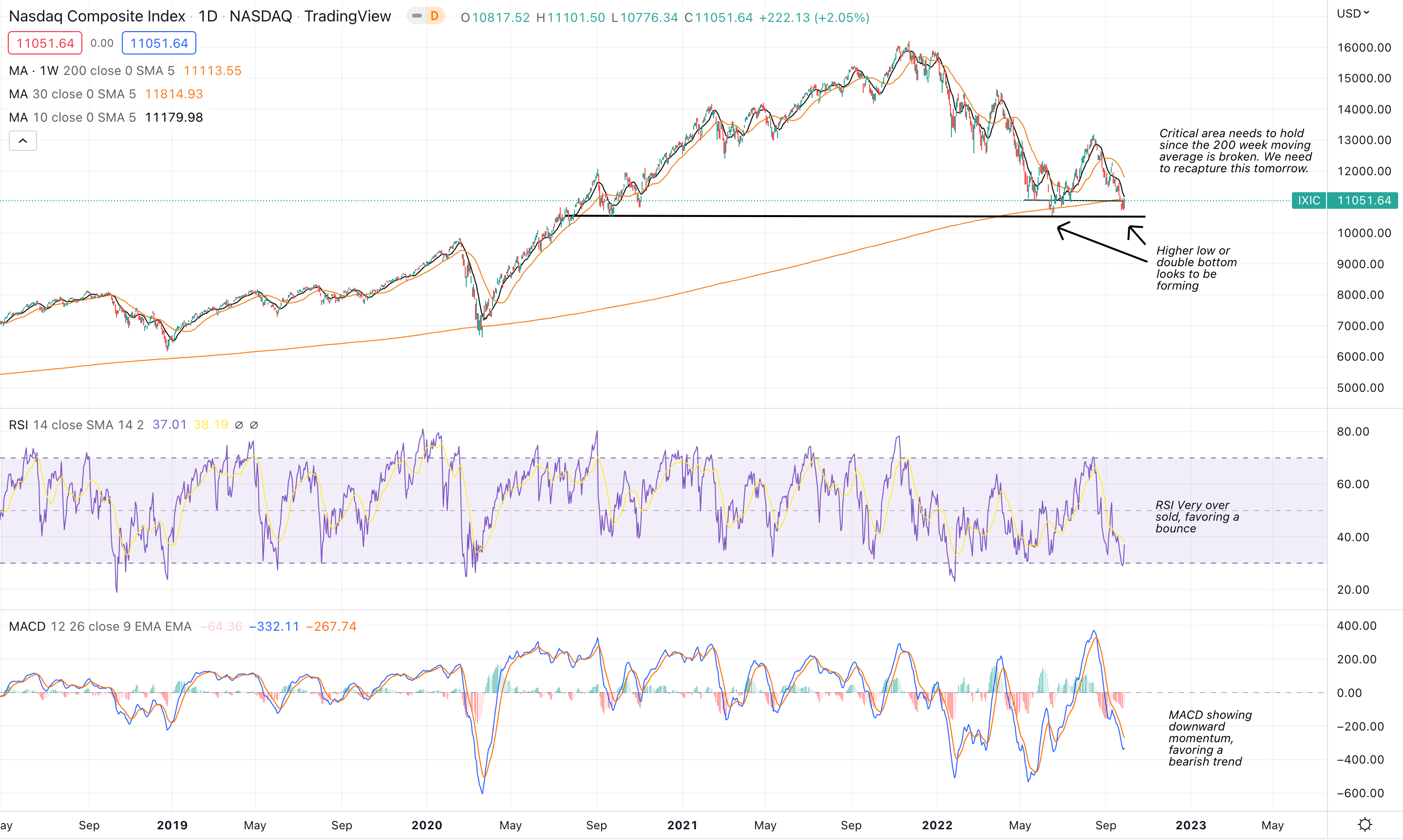
Perhaps the most important development here is that the 200 week moving average was broken. The last time this happened was during the COVID low and, luckily, it was recaptured. We need to look for the market to recapture this critical area, tomorrow. Think of the daily chart as favoring a meaningful bounce with the potential to form a major, multi-month, low. Or, at least until it reaches the 30 day moving average which could be a good area to put on a hedged position if this zone is rejected.
NASDAQ Weekly Chart
The NASDAQ weekly chart is is much like the S&P’s weekly in the sense that it’s relatively mixed. The story here is incredibly similar to the daily chart; major support zone, detached from major moving averages, etc. The only development I saw, that was unique, was how the weekly RSI seems to be forming a bullish divergence.

The bullish divergence is indicative of the RSI forming a higher low despite market technicals retesting a low.
Out side of the RSI, the MACD is looking scarily bearish as it is showing the trend is down. The picture will be meaningfully more clear by the end of this week because it could turn up in the next few days.
Think of the NASDAQ at a make or break moment with a slight bullish favor due to the oversold conditions on a daily basis and it forming, what looks to be, a higher low and double bottom.
Growth ETF’s Are Showing A Better Picture
Looking at both SKYY ETF and ARKK ETF, which best represents growth stocks, the pattern and structure is very clear. This likely appears to be a major low.
ARKK Innovation ETF
ARKK’s moving averages are all out of wack and the technical structure from a “trend” perspective is not exactly clear. However, the pattern and structure is very clear. ARKK is going to continue to carve out a bottom till it reaches the 200 day moving average. At the 200 day moving average, we will find out if Cathie Woods innovation fund will go to zero, or, continue its previous up trend.
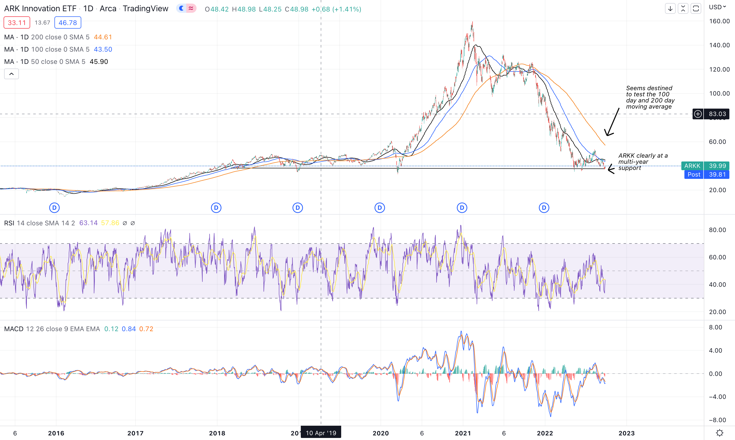
Regardless of my opinion, on a technical basis, it’s incredible obvious ARKK has bottomed since it completed its bell curve. Assuming this doesn’t go to zero, better days are ahead for growth investors and Cathie Woods.
SKYY ETF (Cloud Computing and Tech Growth)
The pattern formed here is about as obvious as ARKK. This looks like a very clear bottom and it will take some sort of economic devastation to drop SKYY meaningfully from here. This is a major area of support while many of the underlying businesses within this space have continued to perform exceptionally well despite macro head winds.

The black lines above are showing major areas of support (we can see it already bounced off one line) and now obviously favors forming a bottom. If this zone can’t hold, the COVID lows seem very likely. This would happen in the event that the NASDAQ undercuts its previous low and begins to make a new low.
Consider this pattern as an area that favors forming a major low. If not, about 20% down from here seems like the next best target. Regardless, the bulk of the selling is well behind us.
If I Only Looked at Technicals and Didn’t Know Macro
I’d say that we are going to bounce here for the next few days/weeks, outside of any major bearish macro catalysts. We have the potential to form a major low on all indices and growth sectors but will need to see key area’s of resistance broken (as well as major moving averages) to justify any sort of conclusions about a meaningful move upward.
I am bullish here and really like what I am seeing in the markets. If we couple in the news about the BoE, as well as the very poor sentiment in the markets, the future looks very bright. Now, we just need the Fed to jump on board and lend us a helping hand.
Stay Tuned, Stay Classy
Dillon